The Casumo Design Language: What Product Teams Can Learn From a Brand That Refused to Look Like Its Industry
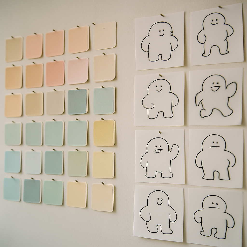
Some of the most instructive design case studies come from unexpected corners. The online gaming sector is not, historically, where designers go looking for restraint or craft — the category's visual defaults have long leaned on gold coins, flashing banners and maximal urgency. That's precisely what makes Casumo interesting. Since launching from Malta in 2012, the brand built its identity by doing the opposite of its category: soft colours, generous whitespace, a friendly mascot and an interface that reads more like a well-made mobile game than a gambling site. For interface designers in any industry, it's a compact lesson in how a design language becomes a competitive position.
Differentiation by Subtraction
Every industry has a visual "gravity" — conventions that pull new entrants toward looking like everyone else, because that's what stakeholders recognise as legitimate. Fintech gravitates to trustworthy blue; SaaS to gradient heroes; gaming, at the time of Casumo's launch, to dark backgrounds and sensory overload.
Casumo's founding design bet was subtraction. Instead of adding more urgency signals than competitors, it removed them: calmer palettes, rounded forms, one clear action per screen, playful illustration in place of stock flash. The Scandinavian design sensibility of its founders — clarity, warmth, an almost toy-like simplicity — became the brand's most recognisable asset. The transferable insight isn't "use pastel colours"; it's that when an entire category shares the same visual vocabulary, the fastest route to being remembered is a deliberate, disciplined departure from it. Subtraction only works, though, when it's consistent — one calm screen inside a loud product reads as a bug, not a brand.
A Mascot as a System Component
Casumo's floating, one-eyed mascot could easily have been a marketing sticker — the kind of character that appears in adverts and never touches the product. Instead it was treated as a genuine interface element: present in onboarding, empty states, moments of celebration and error handling, with a consistent personality across all of them.
That's worth pausing on, because most companies handle character and illustration inconsistently — a cheerful tone in marketing collapsing into bureaucratic strings inside the app. Treating personality as a system component, with rules about where it appears and how it behaves, is what makes a brand feel coherent rather than costumed. When the same character who welcomed you also softens a failure state, the product feels authored by one mind. The craft lesson: personality assets need governance exactly like colour tokens do — defined contexts, defined behaviours, and defined places where they stay out of the way.
Gamified Structure Without Losing the Plot
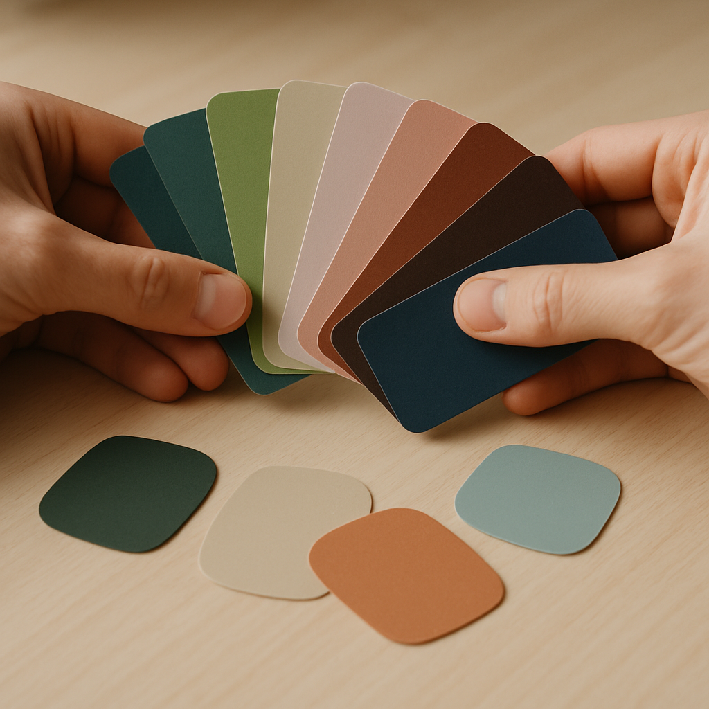
The gamified layer Casumo became known for — progression, levels, collectable rewards wrapped around the core experience — is frequently cited in UX writing about engagement mechanics. What's notable from a design-language perspective is how the structure was expressed: progression rendered as a journey through playful worlds, feedback delivered through animation and character rather than raw numbers, complexity revealed gradually instead of dumped on the first screen.
That is textbook progressive disclosure wearing a costume. And it points to a nuance designers should hold on to: gamification succeeded here not as a bolt-on points system but as a visual and narrative skin over sound information architecture. The hierarchy came first; the whimsy decorated it. Products that reverse the order — whimsy first, structure never — get the confetti without the clarity, and users feel the difference within minutes.
Designing Playfulness Inside a Regulated Space
Perhaps the most relevant tension in the Casumo story for working designers is the collision between a playful brand and a heavily regulated industry. Gaming products must surface responsible-play tools, verification steps, limits and disclosures — content that no amount of charm makes fun. The design challenge is tonal: keeping such moments clear and serious without shattering the product's overall warmth.
That balancing act — friendly system, sober moments — mirrors what designers face in banking apps that must deliver overdraft warnings, or health apps that must present clinical results. A mature design language isn't one voice; it's one identity with a tonal range, and explicit rules for when the playfulness steps aside. Brands that manage it, as Casumo has worked to across a decade of tightening regulation, demonstrate that personality and responsibility aren't opposites; they're layers.
Conclusion
You don't need any interest in gaming to find the case useful. Casumo's decade-plus of design decisions illustrates principles that travel anywhere: differentiate by subtracting your category's clichés, treat personality as a governed system component, let structure precede decoration, and give your design language a tonal range wide enough for its most serious moments. Distinctive design isn't a single inspired rebrand — it's the same handful of choices, defended consistently, screen after screen, year after year.